Origin Story: Brands Going Back To Their Roots
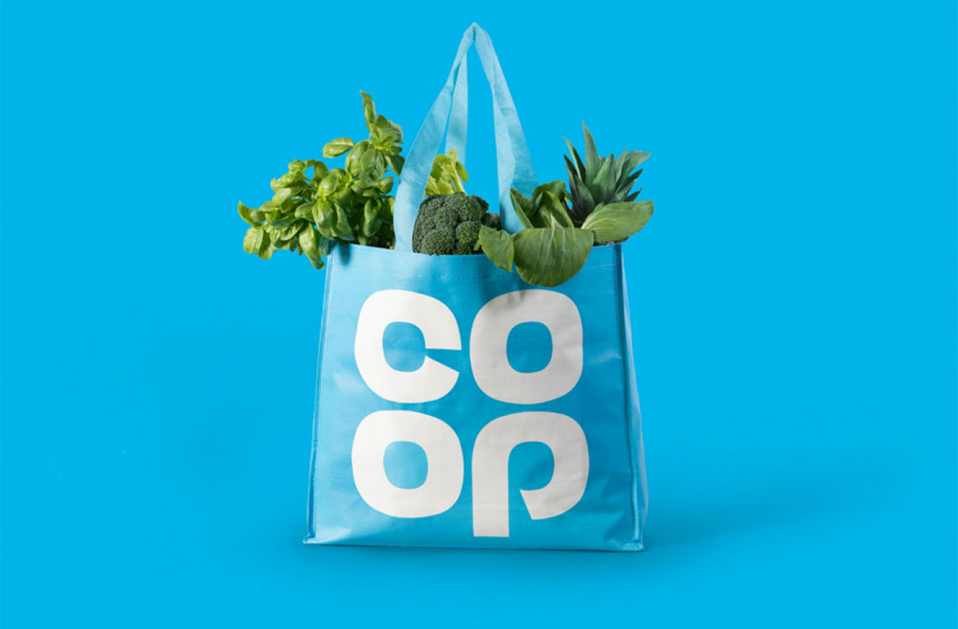
The recent Co-op rebrand has famously taken the supermarket back to its origins, reworking the iconic clover logo of the 1960s. It seems to be part of an emerging trend for ‘going retro’, with other big name brands following suit. Making the future emulate the past seems oxymoronic, but in my opinion it’s actually incredibly refreshing. And as someone who appreciates the history of design, I really hope we get to see more.
It’s reassuring to see a person’s ideas and rationale poured out onto paper, with every tiny element, space and piece of type carefully considered to ensure everything is as appealing as possible. These brands were originally dreamed up by master craftspeople, familiar with tangible objects like pencils, rules and letraset. They didn’t simply jump into Illustrator, throw some shapes around and knock a logo out over the course of an afternoon.
Maybe it’s just me, but it seems we’re increasingly living in a world that’s populated with disposable commodities — food, furniture, shops, even ideas. We’ll never look at a new piece of branding in quite the same way we’d look at, say, an antique chair that was uniquely hand-crafted by a single person through months of hard work and years of experience.
With skeuomorphism firmly behind us, it’s refreshing to see the confidence of brands heading backwards, harking back to the days without gradients, shadows and patterns. Just a simple, bold logo, with a few choice colours working together to say “this is us”. It’s a powerful statement.
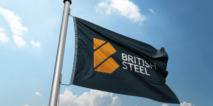
Running contrary to this, British Steel recently unveiled a complete reinvention of their identity, and the reception has been decidedly mixed. With their original brand conceived by David Gentleman (a true creative master as mentioned above), it was perhaps too large an ask to meet those lofty standards. Fair play to the efforts of Ruddocks — I just don’t think many people could come up with a logo that was able to outshine the heritage and craftsmanship of the original.
Amongst the critics of their new logo is leading identity behemoth Michael Wolff — co-founder of the inimitable Wolff Olins and currently head of his own independent studio. He made some particularly scathing remarks:
British Steel’s new mark is the kind of vacuous, glib and un-rooted design that some design companies and their ignorant and hapless clients are capable of inflicting on the world. Whoever was involved in this shocking work should be ashamed of lumbering this crucial resuscitation of a core British industry with such unimaginative, barren and mediocre work.
Harsh words, but it’s difficult to argue with when you look at what came before.
With any rebrand, the initial reaction is usually overwhelmingly negative, as people don’t like change. (Instagram’s recent rethink springs to mind.) But after that first viewing, people need to take the time to digest it, mull it over, see how it sits. Eventually, people usually come around to seeing that it worked.
Unfortunately, I doubt this will be the case for British Steel. I appreciate the thinking behind it, but I still feel the logo should have taken more cues from the original. Then again, maybe I get carried away with romantic ideals. I’m pining for a time when it was all about experience, craftsmanship and consideration.
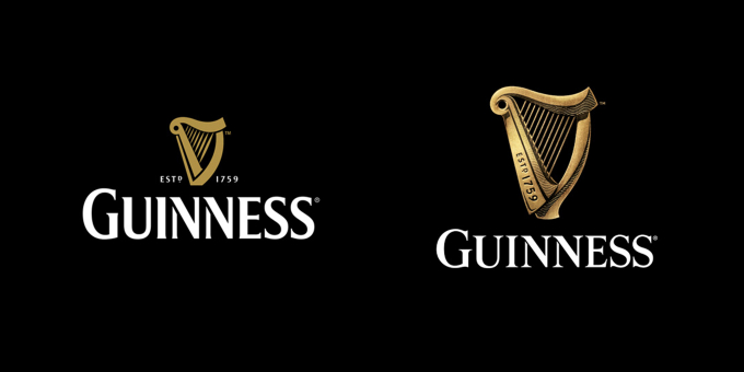
A brand that remains sympathetic to its origins is Guinness. Their latest update undertaken by the maestros at Design Bridge – has been warmly received. I can’t help but think if British Steel approached their update in a similar way – modifying and updating rather than disregarding what came before – their feedback wouldn’t have been so overwhelmingly negative.
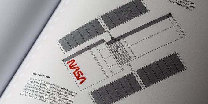
I’m not alone in feeling this kind of brand nostalgia. The NASA Standards Manual has proved itself to be incredibly successful (it even provided inspiration for the aforementioned Co-op rebrand), and there’s certainly plenty of love for British Rail’s corporate identity. And this notion of “going back to your roots” is a really hot topic in the design community today.
With so many businesses willing to embrace the future, perhaps we should first consider looking to the past. On that note, which original brand designs would you most like to see brought back?