Beautiful & Useful: Making The Most of Infographics

Done well, infographics can be great. They give marketing campaigns a central set-piece to focus on. They bring statistics to life and add spice to data. They can grow to become eminently shareable pieces of communication; something fun that people enjoy looking at and interacting with. And they can really help drive traffic to your website.
Done badly, they can be an eyesore. Worse still, an eyesore without purpose.
What is an infographic?
Broadly speaking, an infographic is any visual representation of information – that includes any basic chart, graph or diagram. But with graphic and web design on board to help tell a story, the level of complexity – and interaction – can increase.
The whole purpose of an infographic is to provide value. It’s to help people navigate a series of disparate facts and increase their overall level of understanding of a given subject. If we don’t wish to litter the Internet with digital detritus, we must aim to make infographics both beautiful and useful. When the two elements combine, you end up with something really special.
1. Check it’s appropriate
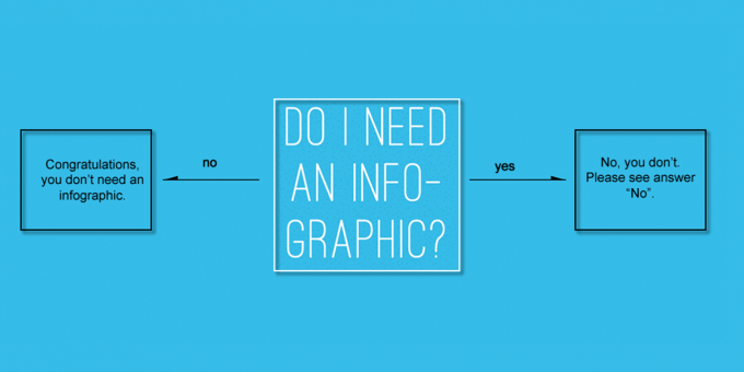
First thing’s first – is an infographic the right way to convey your message? Or are you simply creating one for the sake of it? (There are a LOT of infographics out there today. Think carefully before adding to the pile.)
Just because you’ve crammed a bunch of facts and figures onto a poorly-designed series of pictograms doesn’t mean it’ll instantly “go viral” or form any meaningful connection with your audience. (Here are some classic examples of what happens when infographics go wrong.)
Ask yourself – what are your goals? Your message may be better served as a simple blog post, as a video, or as an animation. It may be more complicated than that, requiring a full app or website in order to do what you need. Let the message dictate the medium.
2. Research your subject
There’s plenty of inaccurate info and spurious facts out there. Don’t go making things worse. To ensure your infographic is as useful as possible, do your research.
If you’re an agency working with a client, ask them the right questions. If you’re operating in-house, pull together the very best, most up-to-date information you have from around your organisation. Don’t be tempted to recycle something from an old report that came out circa 2009.
Think through your concept. If your infographic ends up being any good, it’s likely to be shared around. So make sure you spread up-to-date facts, not half-truths and urban legends. Every properly researched statement or stat adds to how useful your infographic is to the world.
3. Make it intuitive
Don’t overwhelm users. There’s enough clutter to sift through already – make the journey you’re taking them on a pleasant one.
Keep the order logical and simple to follow. If it’s appropriate, tell a story. Don’t bombard users with too much information; serve it up in bite-size chunks. Give visual cues – if they need to click or scroll, make it apparent. If they need to read one thing in order to make sense of another, make sure they know which to read first.
You’ll also want to check for mistakes in the design or the copy. Don’t make it too long either – no matter how fascinating your subject or how polished your design, people will lose interest. Give your infographic a clear finish line; a well-defined end point where users can stop reading or scrolling.
4. Keep it interesting
You should always strive to stand out and not be generic. There are a number of ways to do this.
First of all, a unique design goes a long way. If yours looks like every other infographic out there – utilising all the same fonts, icons and textures – it’s hardly going to stand out. Make it look different. If suitable, bring in humour. Raise a smile from people and they’re more likely to tell their friends about it. Add an usual spin to your topic. Even if you’re tapping into a current trend, try to look at the subject from an unusual angle. The more idiosyncratic your infographic is, the more likely it will translate into “thumb-stoppingly good” content.
Give your infographic a dedicated landing page and make sure you optimise it with relevant keywords and metadata – this is not only better for Search purposes, but also allows more scope for customisation than a static image sitting inside a blog post.
5. Push the concept
Static, single-page infographics can be elegant things. With a decent layout and some thoughtful design, you can bring together info that sits together in visual harmony (and is hopefully more than just eye candy.)
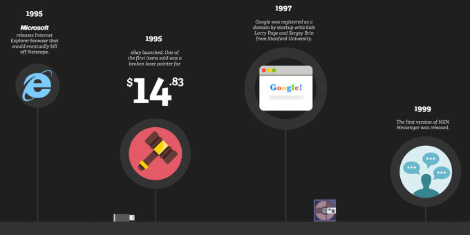
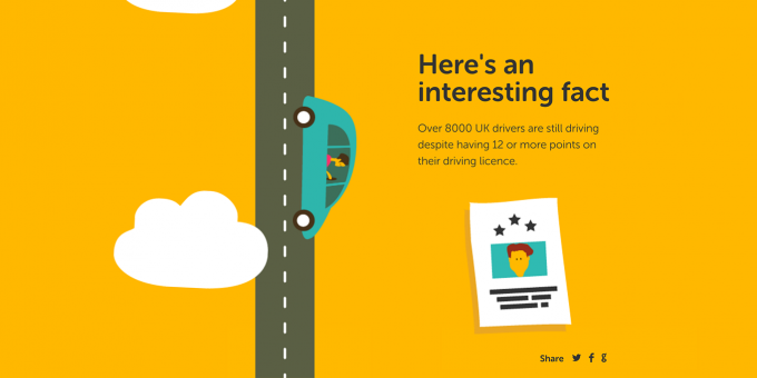
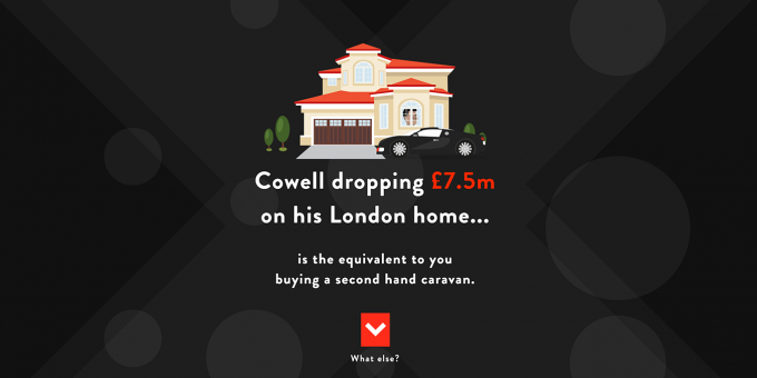
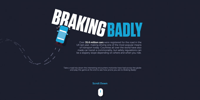
But if you have the budget and the scope, you can create all manner of interactive and dynamic delights, such as this one we put together charting 25 Years of The Internet for our client Onyx, or our award-winning Battle of the Sexes for CitiPark. The one we built for Lemoncake let people see how they measure up against Simon Cowell in the money department, and this infographic for Arriva buses uses subtle animations to bring the whole thing to life. If you have the time, you could even go one step further and build an interactive game to sit alongside your infographic, much like we did with Braking Badly.
Whatever you decide to create, make it easy to share by adding social links. In terms of outreach, contact relevant bloggers and influencers who may be interested in featuring your infographic on their site. Finally, don’t forget to track your campaign so you can measure how successful it’s been.
Conclusion
At Parallax, we’ve created a number of interactive infographics our clients have found both useful and beautiful. We’re always careful to make sure they add value to the overall campaign. If a picture can be worth a thousand words, an infographic – combining text with visuals – may well be worth a million. Just make sure they’re a million words worth saying.