Sport in the Digital Age
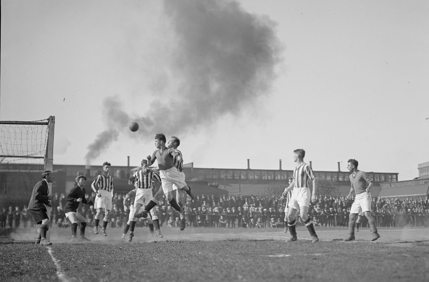
The days of Ceefax from the 1970s through to 2012 will fill sports fans with nostalgia. The anticipation of finally reaching through to your team’s weekend result on page 8 of 8 was thrilling; and even so the second and third time that your side’s league results page came around. The wait of reaching that final page for your team’s score was always an exciting part of the weekend.
Even if you were unfortunate not to have the groundbreaking ‘hold’ button on your remote control, Ceefax and Teletext were the primary source of information for many at the time. The service was switched off in 2012 and ran for an impressive 38 years. Today Ceefax presents a foundation for which the digital age today as we know it lives by.
The Modern Way
The internet has developed vastly over the past 25 years as access to information has changed the way we engage and receive the news that is most important to us.
Development of devices, accessibility, and the commercial attributes that digital offers all industries, now sees users having information in the palm of their hand. In short the Ceefax 302 page was made obsolete.
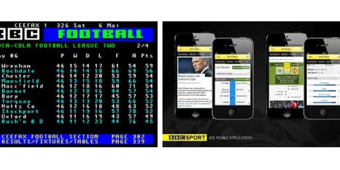
From iPhone applications to desktop notification systems, the quantity and quality of data that has become available is phenomenal and most crucially, in real time. The instant news culture that we live in today has been fundamental to the way we experience all sorts of news and information, but sport has been at the forefront of engaging supporters with technology.
Not only have sporting governing bodies and clubs around the world used digital to benefit their reach, but also in commercial values both in the betting world and in terms of brand culture in which supporters become brand advocates through sharing and promoting content.
What Ceefax Did Well
At the centre of Ceefax’s design was the users needs – something that all web projects structure their build around today. The design and structure of the pages through links, colour and a hierarchy of typography is reflected in today’s web design, some better than others.
With clear call to actions, user centric information architecture, and easy control functions, the simplicity of Ceefax was central to its popularity. It was a platform that eight year olds and eighty year olds could use, and did so regularly.
Ironically, Ceefax wasn’t actually meant to be. Originally designed by the BBC’s engineers who at the time were attempting to produce subtitles on TV programmes for the deaf, found that a normal television picture of 625 lines had ‘spare’ lines.
The engineers worked out that these ‘spare’ lines at the top of the picture could be used to transmit words or numbers.
News for the 21st Century
Learning from the lessons that Ceefax has taught us, the sports world is embracing digital media to its fullest extent, but some much more so than others.
Some of the initial questions that emerge when considering the creation of a sports website include:
- What hierarchy of information should their be for different user groups?
- How will different fixture types be visually represented?
- How should different types of content be broken down?
- What sort of commerce functionality should be included?
- What should the key call to actions be on the homepage?
- How can our blog build an online community?
There are of course the questions that all websites face around responsive design, which challenges the hierarchy of information and how best to present the order of information for different users.
Key questions around how best to approach this include:
- What are the core pieces of content the users want?
- How will they navigate to areas which are now less obvious?
- What call to actions will change for users visiting on mobile devices? (i.e. mobile users are most likely to be at a match or on the way to a fixture).
- Tiered content – can a second navigation bar or breakdown of content better facilitate the users experience on a mobile device than that of a desktop?
There are many questions that need answering during the scoping and wire-framing for any website. Some of sport’s biggest brands do this very well, while some fall short. We’ve rounded up the good, the bad and the ugly of websites in the sporting world.
The Good
Arsenal FC
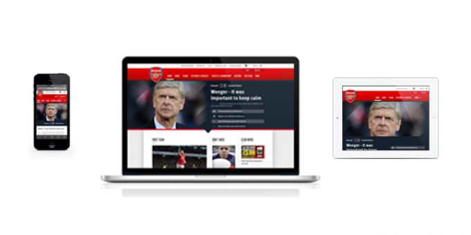
The Arsenal FC website is probably the best in the Premier League. Clean, responsive and intelligently structured the Arsenal website is something for other clubs to live up to (Manchester United take stock).
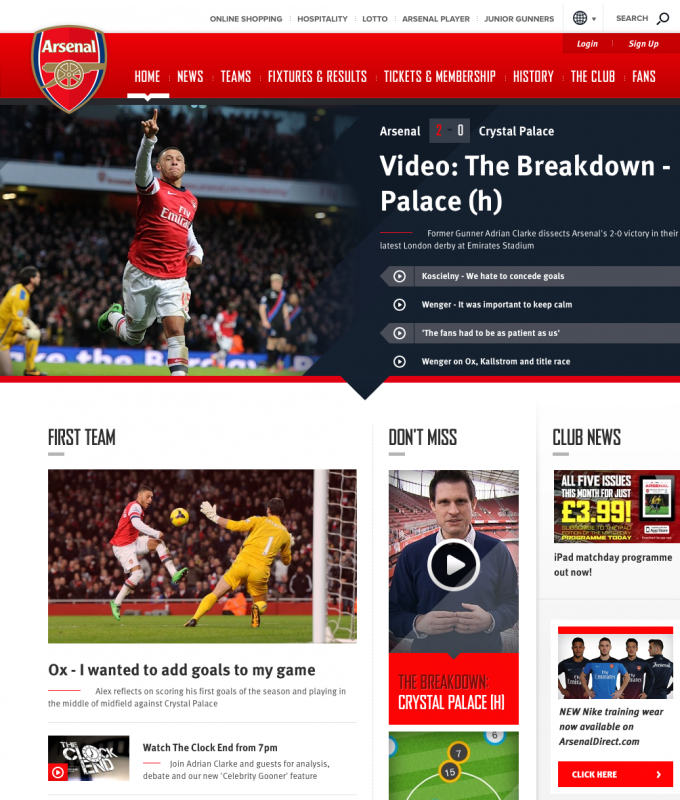
With a consistent visual language and clever use of images, the Arsenal FC website is regularly admired here at the Parallax office. Working beautifully across all devices, the Arsenal digital team have raised the bar for Premier League football clubs.
Yorkshire County Cricket Club
You’ll have to pardon us for blowing our own trumpet, but we’re very pleased with the responsive website we recently created for Yorkshire County Cricket Club
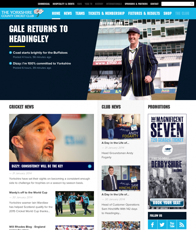
The Yorkshire County Cricket Club website now stands out as one of the best cricket websites in the country. After a thorough scoping process the website effortlessly merges content with design across all devices for a complete user experience.
Tom who project managed the YCCC here at Parallax said:
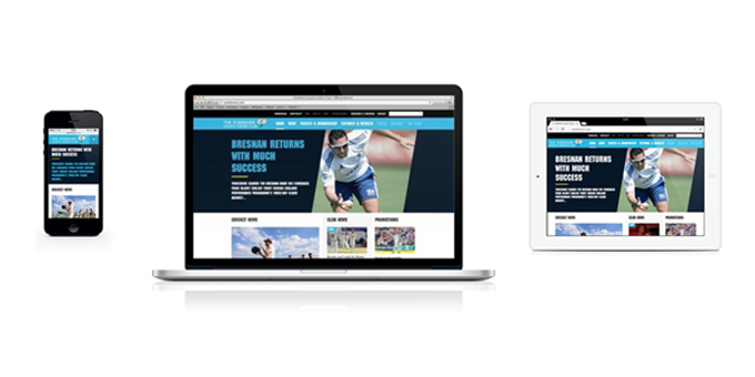
The Yorkshire County Cricket Club website is one of the first fully responsive sports websites, which really sets it apart. Most teams have poor websites that prevent them engaging with users across all devices.
With mobile becoming more prevalent, we thought it was best to prioritise content, and build from there. To do this we focused on the users themselves and prioritised our design around them being able to find content easily.
The Bad
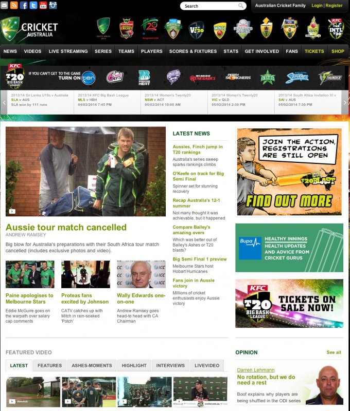
Cricket Australia
The Cricket Australia website is close to being in ‘the good’ category, however it falls short due to the overpowering homepage needing restructuring and reconsideration of the key user journeys, rather than cramming all of its content in one place. The website’s home page adverts add more complicated visuals to what is an already overcrowded page.
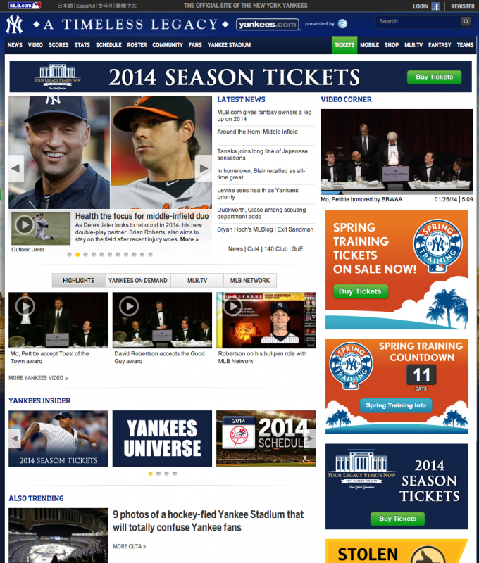
The Yankees
The Yankees website leaves a lot to be desired. It’s really surprising that such a big brand can have such a poor architecture of information. Visually and functionality wise, the website’s poorly curated structure seen here on the homepage and inconsistent use of typography lets the website down.
The Ugly
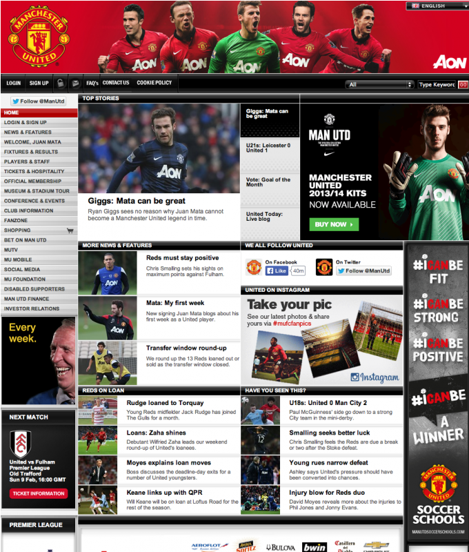
Manchester United FC
Similarly to the The Yankee’s website, it’s shocking that one of the world’s biggest brands can have such a disappointing website.
At Parallax, we understand that a new website is under development from Manchester United, however it’s staggering that a global brand has had such a poor and website for so long. The Manchester United digital team have invested heavily and we’re looking forward to seeing what they come up with.
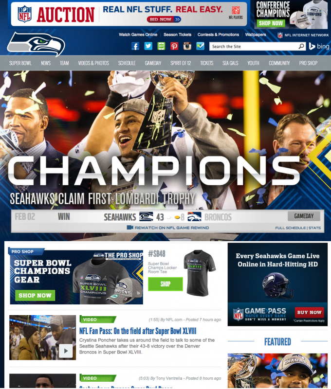
Seattle Seahawks
‘Flat’ design has taken over the digital design world over the past twelve months. Web design is having to incorporate both desktop and mobile users, and the Seattle Seahawks’ mobile website does this really well.
However, the desktop version of the website struggles with confused brand guidelines, cluttered typography, and inconsistent image selection.
With such an asset rich industry, sports websites should be exciting and engaging, reflecting their sports.
Here at Parallax we expect to see more big sports brand and organisations creating flat and mobile friendly websites over the course of the coming year and more e-commerce functionality build in as more users make purchases from mobile devices.
Which sports websites would you add to our categories? Let us know by dropping us a tweet or alternatively you can email us.